Your home/about page is one of the most visited pages on your website, and how can you make it more engaging + inspire calls-to-action?
“Welcome..”?
“Hi, I am a very successful xxxxx…”?
“Not just another life coach/healer/desiger/xxxx…”?
“Don’t miss out this one life time opportunity….”?
Unfortunately phrases like the above have been used way too often, and they become kinda cliche (sorry for being direct). Here are 3 tweaks you can do, and none of them involves a first-class English degree, sophisticated plug-ins or a blown up budget. Instead, I’ll share the psychology, simple practical steps + metaphysical insights!
Plus there are real life examples from our volunteers who submitted their Home/About page review (thank you!!). But, let’s put the website aside for a second.
____________________________________________________________________
I invite you to think about the BEST EVER PARTY you went to…
____________________________________________________________________
Can you remember what the host did? The moment you entered the door, did s/he bombard you with tons of questions?
“Are you stressed about work? Is your love life not working out? Why haven’t you got a 6-figure salary yet? Are you not losing enough weight?”
Of course not, s/he didn’t want to overwhelm you and drive you crazy… S/he didn’t say anything like this either: “We organise this party on a monthly basis, make sure you come here next month at the same time. You don’t want to miss out this one life time chance…I’m not just another party planner…”
If s/he ever says this to you, even if s/he is a one-of-a-kind party host, you’ll probably be rolling your eyes and thinking: “That’s BS. It’s really up to me to decide…” Yeah? What did s/he do instead then? S/he simply put your coat away, gave you a much needed drink – you probably came from a long way away.
And from music choice, food, drinks, other party attendees etc, you felt like that you BELONG to the party, and you can have a great time by just being yourself. Right? S/he didn’t even have to say too much about him/herself right from the beginning. Everything was just natural and s/he made you feel comfortable…
The psychology works the same when someone is checking out your website. Think about it, visitors come to your website because they are looking for a solution to their challenges, yeah?
It’s natural that they are more interested in the potential solution than anything else (including who you are). Well, they will be interested in who you are, but only after you demonstrated that you know who they are. That’s why I spent less than 1/3 of the space on my homepage to introduce myself.
[Update in Jan 2015: I’ve changed the structure of my website since then. But I’m including what it was before to demonstrate my point:
“You, the creative lightworker, do you know that there is a benevolent entrepreneur inside you?
Your service and enterprise is a perfect medium to magnify your impact, accelerate your soul evolution, and provide for you & your family financially.
Unfortunately, our social and cultural conditioning creates too many “entrepreneur blocks” to frustrate you.
To begin with, the word of “entrepreneur” can be a big block itself. You might unconsciously link it with the old school, dull + competitive style.
Other major blocks include “money wall”, visibility issue, the self-doubt b1tch, intuition blind spot…just to name a few.
Carrying those blocks with you makes it damn hard to apply any practical strategies & grow your divine business.
Looking around, why are some people doing better than you? Is it because they are smarter or more gifted than you? Oh no, no, no…They just work on their blocks a lot harder…
If you feel stuck at the moment, PLEASE do yourself a favour – stop beating yourself up.
Instead, make a commitment to release your blocks + learn how to be at one with your business, creativity and money…Miracles do follow, I promise.
____________ [sign up form]
Of course you need to know who you give your email address to, a very fair question! Hello. My name is Yiye Zhang. I am a six-sensory/intuitive/modern psychic (however you want to name it), I “see” your beauty, your gifts and soul purpose. I can help you gain more confidence and remove your obstacles at a deeper level.
I am also systematic and logical – I have a first-class degree in Physics & Maths and have built a 6-figure financial consulting business by 28. I know how money and biz work in a VERY practical way.
One of my most innate gifts is to explain “woo-woo” in simple, doable and fun ways. To be completely honest, it wasn’t that easy for me to come out of the “psychic closet” initially, let alone creating a business around this gift. I share my journey with transparency (through the FREE gift below + my newsletter), along with practical how-to and inspiration to help you create a shining business, through which you can be free from financial worries & enjoy expressing your divinity.”
Even so, it’s not really for any selling purpose, but to show that I’m not a weirdo (or I’m the exact right type of weirdo just for you 🙂 ), and I respect your email privacy as much as mine. So, the first immediate tweaking action you can take:
____________________________________________________________________
# 1. Put them first
____________________________________________________________________
I’m sure you do care about your people, (of course, you are a lightworker). But your challenge is to demonstrate it within the first 10 seconds when visitors are on your site. Demonstrate that you understand who they are, where they are in their life/career right now, what their dream is + which specific challenges they are facing at the moment.
And if you can provide a solution to their most immediate problems, that’s even better! This can be delivered by a free opt-in, or a 30 mins complimentary session. You don’t have to solve a massive challenge immediately. A small + measurable achievement will be great to start a new relationship.
Think about the party again, when you arrived in the host’s place after a long journey, you were thirsty, you probably just needed some water first, before you have any expensive champagne. If you are not clear about who your clients are, I strongly recommend you start doing research.
The earlier you do it, the more pain it saves you for later on. Talk to your audience, ask them questions, actively listen without any interruption. If you are an introvert (and intuitive) and find talking to people is tricky, then you can use your intuition to help you.
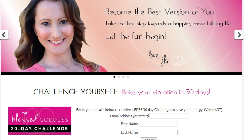
Now here is our first example, thanks for Jody-Lee Smith for submitting!
As you can see, Jody-Lee has a beautiful header + cute signature, which really bring her personality out! There is a free gift, on the top section, available to visitors. Followed by the opportunity for a discovery session. 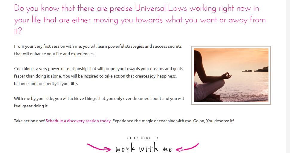 One thing Jody-Lee can do, increase the sign-up/appointment rate, is to be more SPECIFIC about:
- 1) Who are your ideal clients & which group is this?
- 2) Why they need the 30 day challenge, or a discovery session; What are the benefits?
At the moment, “…from your very first session with me, you will learn powerful strategies and success secrets that will enhance your life and experiences…” is very vague. Aim to be more specific, shift the focus to your prospects, instead of your session/or what coaching is about.
To be honest, people probably don’t care the definition of “coaching” – they want their problems to be solved, whether you are a coach, mentor, teacher, healer, or whatever tools you use, it doesn’t really matter… Focus on making them feel understood.
____________________________________________________________________
# 2. What’s THE call-to-action
____________________________________________________________________
Remember the last time you shopped at Amazon? They have thousands of products, but they only give you 6-7 choices on “similar products” at one time.  (yep, that’s what I bought yesterday…nope, not for my niece or nephew :)) Amazon understand well that:
too many choices = no choices taken.
Have ONE call-to-action on your home or landing page (max. 3)
I know it’s tricky because you probably offer program X, Y and Z, 1:1 support, workshops, ebooks… But be strategic here, what’s the most immediate step you want visitors to take?
- Is it to book your complimentary session?
- Is it to sign up to your newsletter?
- Is it to buy your featured artwork?
Then spell it out throughout the page. And don’t give too much distraction to stop people taking this step. Make it easy for people to choose, before they click away. So here is another thing that Jody-Lee can do: 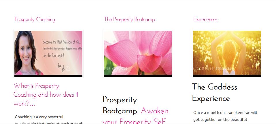 Jody-Lee has 5 calls-to-action on the homepage. Opt-in, discovery session, 1:1 coaching, bootcamp & The Goddess Experience. To inspire a better clarity + conversion, you need to decide what is the ONE thing you really want people to do.
And make it extremely easy for them to take actions. For example, if it is to sign up your list, then make sure you have 1 or 2 more sign-up forms in the footer or side bar; and simplify the 3 events at the bottom to avoid confusion.
If it is to book a discovery session with you, I’d suggest moving the testimonial up, right below the “work with me”; perhaps put “contact form” below it, instead of having a stand alone page (given there are already 9 pages across the top).
____________________________________________________________________
# 3. Visitors detect the vibration when you “composing” your website
____________________________________________________________________
What inspires people to take action is not just limited to the intellectual information. There is an invisible vibration you send out, which can be easily detected/sensed by your visitors.
Your website is like a musical instrument and you are the “musician”. Even with the same function/design/layout, different “musicians” send out different symphonies. Eg, Sora Surya No helps people to have a calm life. And I do feel a sense of peace the moment I visited her website. (One quick suggestion: talk directly to your audience, eg. “helping you”, “your inner voice”, instead of “helping others”) 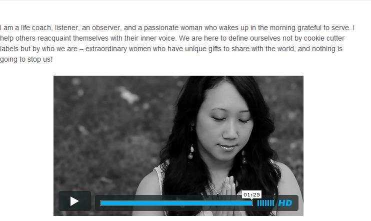 You want to be inspired + joyful, while building your website. Otherwise visitors can sense the dreariness or frustration and quickly click away… If writing is not your primary communication method, then be creative here…eg, your own art work can be a really powerful tool to assist you. Eg, Julia is a good writer, she also uses her artwork throughout her website, isn’t it adorable?
 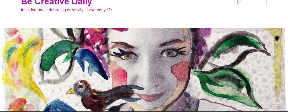 If you are pulling your hair, feeling frustrated – STOP. Don’t force anything. Go out to play a lot, take a walk, go to the spa, talk to a reliable mentor/friend… As soon as you let it go, you will be sent back into the flow. Going back to Jody-Lee’s example, I think she did really well on this. While browsing her website, I certainly felt her joy and warmth.
She radiates behind her website.
And I’m sure you can too, because this one only takes attitude 🙂
If you do 3 things right and consistently, a simple and basic home/landing/about page can provide you a beautiful conversion. I’m talking with experience – as you can see, I don’t have any fancy designs and I use the most basic theme in wordpress. Don’t feel pressured that you have to make a lot of changes.
Start tweaking, enjoy the process + receive more insights + tweak again + enjoy every step. Whenever in doubt, refer back to #3, nothing is more important than you experiencing the joy while building your dream business!
____________________________________________________________________
Action time
____________________________________________________________________
Implement some changes + increase your conversion today! And tell us what actions you’ve taken. If you want more in-depth, personalised 1:1 guidance, you are welcome to check out the VIP Intensive. In addition to practicality, I use intuition to “see” your true life purpose + help you bring alignment via your website (thus more clients and money). With love, Yiye New here? I invite you to check out more FREE resource on improving conversion and building confidence to turn your purpose into prosperity.
Related post: 1 business advice I’m glad that I ignored

I loved this post Yiye! Thank you for the practical advice. I tweaked my homepage after reading the first step, and it already feels more like me. And, feeling more like me makes step #3 so much easier. I’m excited to keep playing with everything. Thank you!
Hi Amberlee – I’m genuinely happy that you find this post helpful! And congratulations for your beautiful website – I’m sure it will bring a peaceful and loving vibration to many!